Tuesday, May 18, 2010

My Team Logo


Presented with the need to choose an original sport, I chose fishing. As it turns out, it is the only sport I’m good at. I mean, where else can you sit by a river with a beer for 4 hours and call it a sport? Too bad I’ve never caught anything but pondweed.

Concerned that this particular sport was too lethargic for a Greek hero’s liking, I narrowed it down to sport fishing or competitive fishing involving a team of two to three fisherman.

Next, a name was required. In a class exercise several names came up including The Woodspears, The Marble Warriors and The Burnt Greek.  None of them really ignited as ideas, but the random name ‘Dumbfishers’ caught my eye. My pencil decided to tack three Greek competitive fishermen on top who looked like they were having a good time. Something kind of clicked and this idea really seemed to be working.

The 'fishers' part of the name comes from the Greeks love of boats, fishing, and nets. I swear that the ‘dumb’ part comes from the Trojan Greeks who stupidly let in the Trojan horse, and not general Greeks themselves. Far be it for me to insult Greek intelligence, their amazing completely not outdated hairstyles, and their modesty when it comes to food...

 With name out of the way, I developed an illustrative graphics logo. Many sports logos include complicated vector illustrations into their logo (instead of a simple corporate style), so I know this will not be out of place. What will be out of place is the fun style I'll do it in, and I'll explain why.

Sports logos are always so angry and combative, and while these traits are great for pure competitive sports, they don’t fit in that well with something a little more laid back like fishing. Therefore I am using a fun, almost childish style to emphasise that fishing is different to every other sport: the fun is primarily in the doing nothing, not the competition. Doing a corporate type design would betray the fishing team's very essence.

I envisage 'The Dumbfishers' as a local fishing club based in Greek, having fun while also respective of ancient Greek traditions. I just couldn’t tie Achilles directly into the name but I vowed to include a ancient Greek chariot somewhere in the design as a nod to Hector’s humiliating drag behind a chariot while dead. This is much like how fisherman parade around with their massive prize fishes (or photos of).

The fisherman to be included behind the chariot are going to be very simplified and stylistic, similar to my current sketch (but developed much further of course). The typeface is going to be classic Greek, and the colours of the whole design will be white and blue - with orange or black touches if needed. I will try and include some Greek hairstyles on the fishermen in the final vector design...

Three Designs:


Thursday, May 6, 2010

AGIDEAS

TRENDS AND DESIGNERS

There were many, many design trends seen at AGIDEAS. In the following blog section I will discuss two of them.

Illustration 

When computers came out the revolutionized the world. Their effect reached everywhere, no less the areas of graphic design. Saving hours of time, they influenced design to the point of 'digital' being the new look.

More recently, illustration has started to come back as a backlash from all the 'digital-ization' running rampant.

Michael Mabry is a classic example of this. He tries to hand-craft everything, so as to challenge the mind and touch the heart. Ironically, he was approached by Adobe at one stage to do some digital work for them. However, he still kept to his hand-styled approach.


Eamo Donolley is a Melbourne illustrator. Growing up in the 80's, the culture of that period heavily influences his work. Hand-drawing his initial drawings, he places them into art programs such as photoshop and then colours them.


Australian Stuart Campbell blurs the boundary between digital and hand-drawn. While still illustrative, it is entirely based in the digital program Flash. His interactive web-comics are typical of this boundary blurring with the hand-drawn meeting digital and creating illustration.


Typographic

My second trend is typography. While typefaces have been around for centuries, their use in artwork is much more recent. An example of a typeface designer is Wayne Thompson, who works in Australia. Here is some of his work:


However the trend I'm discussing is typographic layout, not typography itself. Dean Poole uses typeface-based design very well. For the below image, Dean used the trademark, copyright and registered trademark symbols as part of the actual design. This work is for New Zealand law firm Hudson Gavin Martin and is indicative of what they are.

Andreas Uebele is a German design director. He works mainly with signage and corporate communications. He really pushes the boundary of signage such as the below work where he put typography on the ceiling, where it had never been placed before.


CONCEPT EVALUATION
Dan Formosa

Dan Formosa is a founding member of Smart Design. A US company, it specializes in product design and ergonomics.

His company did some work for Ford, which involved designing the user interface for a car. One of the key selling points was the 'green metre' which is designed to keep the driver environmentally conscious of his fuel usage. The biggest problem was that the driver needed to focus on the road and speedometer, not an extra gadget. So instead of a needle gauge, Dan made a computer screen that resembled a glass with raising or lowering liquid. This was placed so as to be seen with the driver's peripheral vision, avoiding distraction.

 
Quite often gadgets are designed to be loud and shiny. I believe this design is highly successful because it integrates with the driver and doesn't distract him or her.

SOURCES
http://www.agideas.net/home
agideas design conference 2010
http://www.smartdesignworldwide.com/
http://www.uebele.com/

Monday, April 12, 2010

Aboriginal Motifs


Functions and Philosophies

Communication, Consultation and Consent
To design a logo and miscellaneous for an aboriginal community-based footy team presents a number of challenges.

Using images created by indigenous communities or ritual imagery without any sensitivity can be disrespectful. Traditional artists need to be sought out, or a representative from the traditional land owners. A translator may be needed and the discussions may take time, especially if the work includes a secret or sensitive parts. One big issue is photography of indigenous people. Photographs (especially of the deceased) can cause distress to relatives, especially if these images are published.

Secrecy & Confidentiality
Awareness of secrecy and confidentiality needs to be maintained. This is especially a problem if the artwork contains initiation or religious practices. Some work is considered sacred, this should be respected. Secrecy and confidentiality of individual people needs to be honoured, especially of the deceased.


Moral Rights and Issues
Moral rights for Indigenous art is covered by the same copyright as elsewhere in Australia. This includes "the right to be attributed as an artist", "the right not to have work falsely attributed to another artist," and "The right of integrity" (doing things that damage or mutilate the work, even as minor as photocopying it at poor quality!)
Protocols for producing Indigenous Australian visual arts

But there is more. Indigenous Australians are so community based that even their artwork can be seen as community owned. A draft amendment to the Copyright Act was proposed in 2003 to recognize this fact.


Bibliography

http://keystone.collectionsaustralia.net/publisher/Outreach/?p=4248www.copyright.org.au
http://www.un.org/esa/socdev/unpfii/en/declaration.html
http://en.wikipedia.org/wiki/Indigenous_Australians
http://www.australiacouncil.gov.au/research/aboriginal_and_torres_strait_islander_arts/reports_and_publications/indigenous_arts_resource_list
Protocols for producing Indigenous Australian visual arts: by the Australian Council for the Arts

Native American Motifs

Syracuse Chiefs
Current Logo:

Cap Logo:

Alternative Logo:

 Logo 1997-2006:

Logo 1987-1996:

Logo 1961-1979:

The current logo contains the text 'chiefs', and incorporates train symbology in a very stylised manner. Colours silver, blue, white and black merge to give a metallic stylized look.

The logo is trying to play on the theme of the railway chiefs such as the Super Chief from Chicago to Los Angeles, and Amtrak's Southwest Chief. This is despite the fact that neither went anywhere near New York's city of Syracuse. The baseball club is trying to tap into that tradition of railway chiefs, despite having not exactly earned it.

The Syracuse Chiefs didn't have the train theme in its initial years. Initially the Montreal Royals, they moved to Syracuse in 1961 and had the rename. Their logo became an illustrated representation of a native American's head, complete with feathered headdress. It became very stylized in 1987. Ten years later they were re-branded as the Syracuse SkyChiefs in an attempt to respect native Americans. However they have reverted back the the 'Chiefs' and now have the new train logo.

While changing the 'chiefs' meaning to 'railway chiefs' tries to respect native Americans, even the 'railway chiefs' themselves had their name and theme derived from Indians. Also of note on the Syracuse Chief's website was the 50th season anniversary logo: it has a traditional native feather headdress draped over it. If this is a show of respect, it seems to be a very shallow one.

Sources:
http://www.csrmf.org/
http://www.atsfrr.com/resources/Haben/Life/4-18-38.htm
http://www.sportslogos.net/team.php?id=936
http://www.minorleaguebaseball.com/index.jsp?sid=t552

Monday, March 8, 2010

Melbourne Sports Museum Critiques


Melbourne Cricket Ground (MCG) Logo
Current


Critical Description
This design is very symbolic. For a very well known sports venue famous around Australia, there is a lot of pressure on the logo. It is imperative it uses all the art elements and principles well, as well as other art styles.

The logo is fairly straightforward, in a proportional way. The colours range from yellow, green to blue in varying shades of analogous hues. Combined with white, it produces a rather pleasing visual effect.

Elements and Principles
Linework is used in the form of 'fingernail' shaped blue lines around the circle in the centre of the logo representing the grand stand. While there isn't exactly a texture to the logo, the gradient in the centre circle certainly makes up for it. Shape is used well: the central circle not only represents the playing field, but I think it also gives a nod to the shape of an aussie rules football in the fact that it is not a straight circle but more of an oval shape.

Going on to the principles: the logo is very centrally and equally balanced. There is nothing dynamic about it at all - apart from perhaps the grand stand blue lines. However these are more rhythmic than anything else, and seem to shimmer around the central circle playing field.

Art style
The art style is a lot more contemporary and doesn't really have much of a 'professional business' feel to it that many big company logos have. The typeface choice is very square and contemporary, however it is centered in the middle of the logo and seems diminished by the surrounding 'fun-style' iconography.

Concept/Theme
The concept behind the logo is very clearly the MCG itself. The playing field is represented a green circle with hints of blue and yellow at each corner, anchoring it into what is kind of recognized as the Australian theme colours. The blue curved lines around the circle are reminiscent of the grand stands of the MCG. What is interesting is the several variations of the logo around the place (which I am unable to include here). Some have the text built out of circles, and others have the large playing field fluorescent lights swirling around the MCG.

Personal
I believe the logo itself is very effective. It is both fun and has the flicker of an air of professionalism to it. What I find disappointing is the usage of the logo... it seems to conflict a lot with the other logo variations - I believe this confuses people in regard to the logo (it confuses me at least...!) I think a stronger use of a simple logo would promote unity and make things a lot easier.


Sydney Swans Uniform
Current


Critical Description
This is the Guernsey of the iconic Sydney Swans AFL team. It uses a variety of different artistic styles to assist in its portrayal. Negative space is used on the front, with the Sydney opera house silhouetted out of the bottom of the red 'V'.

Elements and Principles
While there isn't a lot of linework (bar the Guernsey material texture) or and no texture at all, the shape of the items on the uniform really pop out and cement the elements of design. Colour is used in an attempt to assist with this, the hue is very garish.

The logo is centered on the vertical axis, but spins dynamically on the horizontal. The red 'V' intersects the asymmetrical opera house on this axis. No rhythm or sense of scale is really used.

Art style
There isn't an art style as such to the uniform, it is kind of line a national flag in that regard. There is no doubt as to the symbolic value of flags and uniforms, both aim to evoke a sense of pride rather than wow with visuals.

Concept/Theme
To be honest there isn't much of a concept behind the uniform. Sydney was the South Melbourne Football Club until 1982, and the colours of red and white date back to the 1890s. The red V was introduced in 1932, and it seems that in the 1982 move to Sydney a silhouette of the Sydney opera house was tacked to the bottom of the red 'V'.

Personal
I feel that this uniform is a bit of a failure. The 'V' could be done in a bold aggressive way, but not only is it a basic, stock standard 'V', but a failed portrait of the Sydney opera house is intersecting its otherwise sharp point. The opera house is done so small that it is unrecognizable us such unless you get close and stare hard for a a good 10 seconds. At a glance, a rookie to the game may in fact think it represents a little patch of footy turf.

http://home.vicnet.net.au/~nickname/afl.html#swans
http://www.sydneyswans.com.au/Swans/TheClub/History/tabid/7210/Default.aspx
http://www.smh.com.au/news/afl/day-the-bloodstained-angels-were-born/2006/09/01/1156817102957.html


Critiquing Tools


ART VOCABULARY LIST
Negative space is the space between objects or the parts of an object, for example the area between a cup and its handle. Also the space between an object and the edges of the canvas, i.e. the space around an object.
http://painting.about.com/cs/paintingknowhow/g/negativespace.htm 

Smudge (or scumble)— There are two senses for this term. Its earlier meaning: a broken passage of opaque or translucent color (often paint) skimmed or dragged across the surface in such a way that each color is visible, each modifying the other, or, to apply a color in this way. This technique was developed by the Venetian school of painters (chief among whom was Titian, c. 1488 - 1576), who passed dry, opaque coats of oil paint over a tinted background to create subtle tones and shadows. Although this painting technique dates to the 16th century, use of the word "scumble" in order to refer to it is unknown before the late 18th century. The origins of the word "scumble" are blurry [!], but the word is thought to be related to the verb "scum," an obsolete form of "skim" (meaning "to pass lightly over"). A later sense for scumble: to smudge or smear the lines, edges, or colors in an image by rubbing lightly. This use appeared in the mid-1800s.
http://www.artlex.com/ArtLex/Sc.html

Proportion is a principle of art that describes the size, location or amount of one element to another (or to the whole) in a work. It has a great deal to do with the overall hamrony of an individual piece.

http://arthistory.about.com/cs/glossaries/g/p_proportion.htm

Rhythm is a principle of art that's difficult to summarize in words. Assuming that you've picked up on a rhythm in music before, take what you heard with your ears and try to translate that to something you'd see with your eyes. Rhythm, in art, is a visual beat.
http://arthistory.about.com/cs/glossaries/g/r_rhythm.htm


Middle ground
A point of view midway between extremes: "the middle ground between news and amusement" (Roderick Anscombe).
http://www.answers.com/topic/middle-ground


ADJECTIVE LIST
Concerning Colour:

Shade - A color to which black or another dark hue has been added to make it darker, tending to make them neutral in color. For example, black added to green makes it a darker shade of green. Value changes from pure hues are called shades and tints. You can see this in the color wheel below. On the right, pure hues are marked by dots. The shades made from those hues are under them.
http://www.artlex.com/


Warm
warm colors - Colors are often described as having temperature — as warm (reds, oranges, and yellows), or cool (greens, blues, and violets). Warm colors are often associated with fire and the sun. They appear on one side of the color wheel, and opposite the cool colors. Psychologically, warm colors are said to be stimulating and passionate. Optically, warm colors generally appear to advance, coming toward the viewer.
http://www.artlex.com/


Garish
1.
a. Marked by strident color or excessive ornamentation; gaudy.
b. Loud and flashy: garish makeup. See Synonyms at gaudy1.
2. Glaring; dazzling: "Hide me from Day's garish eye" (John Milton).
http://www.thefreedictionary.com/garish

Polychrome
• adj. painted, printed, or decorated in several colors.
• n. varied coloring.
∎ a work of art in several colors, esp. a statue.
• v. [tr.] [usu. as adj.] (polychromed) execute or decorate (a work of art) in several colors.
http://www.encyclopedia.com/doc/1O999-polychrome.html


Analogous colors are colors that are adjacent or next to one another on a color wheel. An analogous color scheme is one in which only three adjacent colors are used. The theory is that colors work well or harmonize together. Usually one of these colors is dominant, or used more than the other two, in the painting.

http://painting.about.com/od/artglossarya/g/defanalogous.htm


PRINCIPLES and ELEMENTS of DESIGN LIST

Basic ELEMENTS of Design

Line
Line can be considered in two ways. The linear marks made with a pen or brush or the edge created when two shapes meet.

Colour
Also called Hue

Texture
Texture is the surface quality of a shape - rough, smooth, soft hard glossy etc. Texture can be physical (tactile) or visual.

Shape
A shape is a self contained defined area of geometric or organic form. A positive shape in a painting automatically creates a negative shape.

Form (aka shade/value)
Value is the lightness or darkness of a colour. Value is also called Tone

Basic PRINCIPLES of Design

Stability (better known as Balance)
Balance is one of the principles of art which describes how artists to create visual weight.
http://www.alifetimeofcolor.com/study/g_balance.html

Dynamics
a) characterized by action or forcefulness or force of personality; "a dynamic market"; "a dynamic speaker"; "the dynamic president of the firm"
b) of or relating to dynamics
c) moral force: an efficient incentive; "they hoped it would act as a spiritual dynamic on all churches"
d) active: (used of verbs (e.g. `to run') and participial adjectives (e.g. `running' in `running water')) expressing action rather than a state of being
wordnetweb.princeton.edu/perl/webwn

Rhythm
Rhythm is one of the principles of art. Visual rhythm makes you think of the rhythms you hear in music or dance. Artists create visual rhythm by repeating art elements and creating patterns.
http://www.alifetimeofcolor.com/study/g_rhythm.html

Scale (also known as Proportion)
Proportion is one of the principles of art which describes the size, location or amount of one thing compared to another.
http://www.alifetimeofcolor.com/study/g_proportion.html

Style Time Line


Ancient Art
4210 BC - 287 AD
Egyptians, Minoans, Mesopotamia


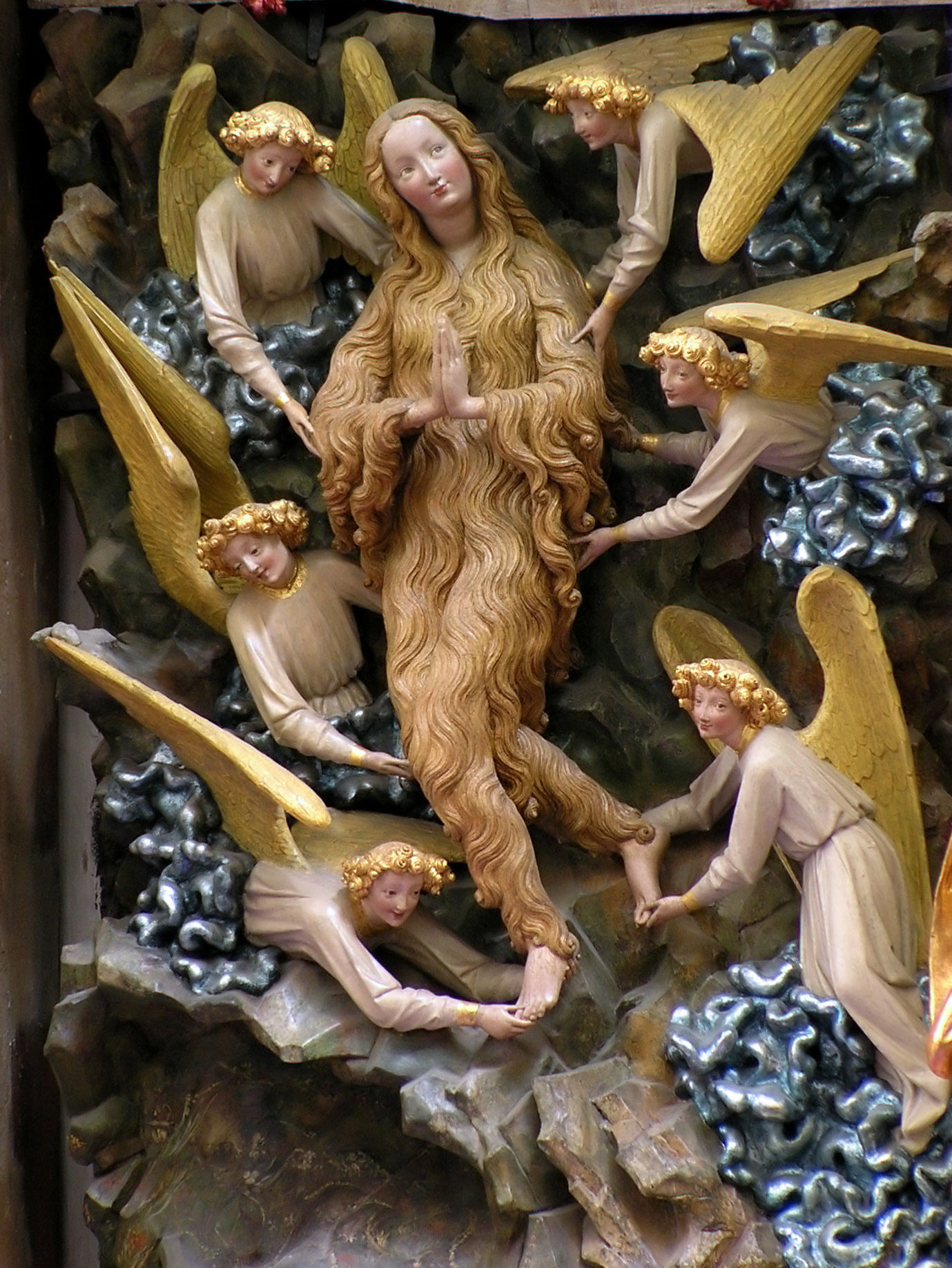
Gothic Art
12th Century AD - 15th Century AD
Giotto, Fabriano


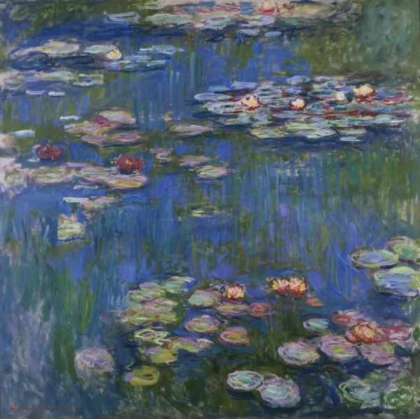
Impressionism
19th Century AD
Monet, Renoir, Rousseau


Art Nouveau
1890 AD -1905 AD
Gustav Moreau, Max Fabiani, Alphonse


Post-Impressionism
Circa 1910 AD
Henri Rousseau, Gauguin, Seurat


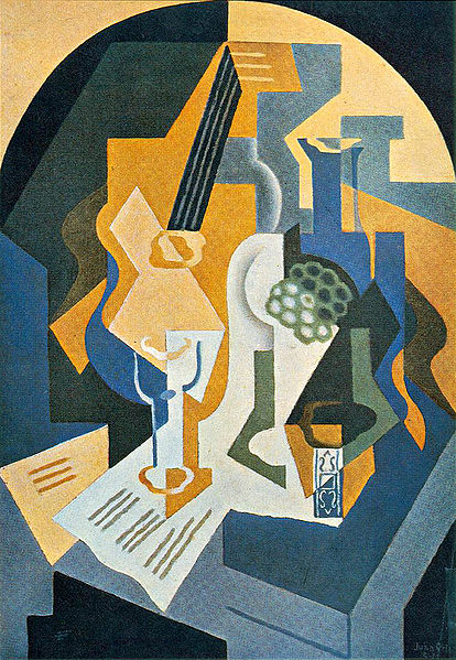
Cubism
1907 AD - 1911 AD
Pablo Picasso, George Braque


Bauhaus
1919 AD - 1930 AD
Kandinsky, Albers


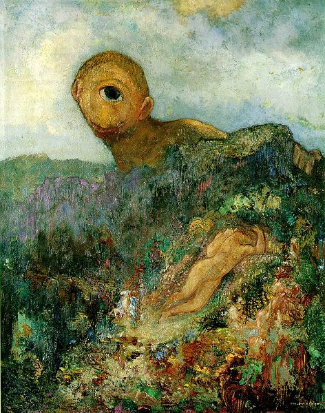
Surrealism
Began 1920 AD
Salvador Dali, Maxim Gorky


Minimalism
Began 1960s and 1970s
Piet Mondrian, Eva Hesse


Postmodern Art
1960s+
Cindy Sherman, David Wojnarowicz